
Selecting an optimal cover letter font makes your document professional, legible, and visually appealing. Since the majority of your letter is written—with little to no graphical elements—the choice of font is one of the most important ones. A good typeface leaves a strong first impression on hiring managers and helps them experience your letter optimally.
In this article, we’ll explore some of the best fonts to use for your cover letter. We’re going to find out what makes them good, in which situations, and for which professions. We’ll even mention some of the fonts you should avoid.
Without further ado, let’s jump right in!
Key Takeaways
A good cover letter font makes the document professional, visually pleasing, and easy to read.
Some of the best fonts for a cover letter include Arial, Calibri, Garamond, Helvetica, and Cambria.
Fonts to avoid include Comic Sans, Courier, Papyrus, and any other script with an overly ornate typeface.
Serif fonts are typically better for traditional roles, while sans-serif variants are tailored toward modern professions.
Appropriate use of bolding, italicizing, capitalization, and color enhances the legibility and visual appeal.
The Importance of Using the Right Cover Letter Font
Choosing the right cover letter font is imperative, as it impacts both the aesthetics and functionality of your cover letter.
For starters, a good font significantly enhances the readability of your cover letter. It helps the document convey information quickly and efficiently. This allows hiring managers to find relevant details effortlessly, even when quickly skimming through your document.
Another benefit of a well-chosen font is that it demonstrates your attention to detail and professionalism. Choosing a clean, elegant, present-day typeface emphasizes expertise and respect for industry standards, while an inappropriate font can make you appear unprofessional and careless.
In addition to choosing the right typeface, you should also consider your cover letter font size. The optimal size is between 10 and 12 pt, and going above or below these conventional values significantly reduces the readability of your letter and makes it less aesthetically pleasing.
Finally, you can use a good font to enhance the overall message of your cover letter. For instance, serif fonts should be your choice to convey elegance and sophistication. Alternatively, sleek sans-serif variants are great when applying for contemporary or tech-oriented roles.
11 Best Cover Letter Fonts

For starters, here are some of the best fonts for a cover letter. We’ll examine each one's strengths and weaknesses and give you suggestions for which industries it is best suited for.
#1. Arial
Arial is one of the most widely used fonts and a default for Google Docs. It’s a great all-around cover letter font due to its clean and simple sans-serif design, making it easy to read on-screen and when printed.
This typeface's contemporary and straightforward look makes it perfect for cover letters in the technology field and when applying to modern companies in business or finance. Arial’s adaptability makes it perfect for the majority of business documents.
Ultimately, Arial is one of the safest choices for your cover letter font, regardless of the job you’re applying for. However, it can make your document appear too generic when applying for roles that require a touch of creativity.

#2. Calibri
Calibri is another highly popular font and a default typeface for Microsoft Office. It was designed to be modern and professional, ensuring compatibility across systems, devices, and documents.
When you set the same cover letter font size and spacing, Calibri allows you to fit more text in the same amount of space compared to Arial. This makes it perfect if your writing is lengthy but you want to maintain an elegant and minimalist look.
This is another sans-serif font tailored to modern jobs and professions. For instance, Calibri is a great pick for a marketing or consulting cover letter.

#3. Garamond
Garamond can add a touch of elegance and style to your cover letter. This timeless serif font has a lengthy history and widespread application.
While Garamond might be outdated for some modern industries, it’s perfect for those roles where you want to convey a sense of tradition, reliability, and sophistication.
For instance, if you’re into the arts or publishing, you can use Garamond as your cover letter font to demonstrate finesse while subtly hinting at an in-depth knowledge of the craft.

#4. Helvetica
Helvetica is one of the most famous fonts in the world. It’s popular due to its exceptionally crisp and clear look, which makes it highly versatile and usable in both traditional business documents and contemporary graphic design.
The neutral and flexible nature of Helvetica makes it a solid pick for your cover letter, regardless of the industry you’re in. Still, it’s a sans-serif font with an artistic pedigree. That’s why you should consider it when writing a cover letter for architecture, social media, graphic design, advertising, and similar roles.

#5. Cambria
Cambria is a serif font that sports a traditional look with a modern appeal. This combination makes it perfect for classic fields that require a contemporary approach, such as law, business, or education.
One of this font’s key strengths is its flexibility, since it was designed for both printing and reading on screens. This versatility extends to this typeface’s usability, making Cambria easy to scan and interpret.
Ultimately, it’s a balanced font and a solid pick for most traditional fields. A minor downside of its classic appearance with a modern twist is its neutrality, so it might not be as distinctive as some other typefaces.

#6. Trebuchet MS
Trebuchet MS is a humanist typeface designed to have a warm and friendly appearance. One of the main characteristics of this cover letter font is that it’s approachable while still being clean and professional. That’s why it’s great for non-profit cover letters or job seekers in the education and communication industries.
On the other hand, keep in mind that this sans-serif font is less formal than other similar options, so you should avoid using it for highly traditional fields.

#7. Georgia
Georgia is, in a way, similar to Cambria in that it’s another classic font designed with modern use cases in mind. It’s a traditional serif typeface with a background in historic typography. The contemporary twist is that it was developed to be easily readable on screens.
This cover letter font’s strengths are also its weaknesses. Georgia’s classic and readable style makes it perfect for digital marketing or publishing cover letters. On the other hand, this font might be too casual for formal applications.

#8. Verdana
Verdana is another humanist font designed with a focus on legibility. Its excellent readability on screens makes it perfect when you’re submitting a soft copy of your cover letter, though these benefits extend to printed copies as well.
The main factors contributing to Verdana’s readability are its larger x-height and wider spacing compared to similar fonts. These attributes make this sans-serif typeface look clean and spacious and make it a solid pick for tech, media, customer service, and similar fields.
#9. Tahoma
Tahoma is a straightforward sans-serif typeface and a great cover letter font when you just want to make your writing legible and professional. It’s a reliable choice when you’re applying for a practical role in business, customer service, or similar fields.
The simplicity of Tahoma’s design makes it utilitarian to the point where it can be seen as too plain. It’s a solid font that might not grab attention like other typefaces on this list, but it also won’t be a poor pick, regardless of the role that you’re applying for.
#10. Times New Roman
Times New Roman is one of the most famous serif fonts, renowned for its highly traditional appearance. While this font conveys extreme seriousness and traditional reliability, it can be seen as old-fashioned when used inappropriately as a cover letter font.
That’s why you want to use Times New Roman in specific instances when applying for certain positions in law, academia, or government. When used properly, this font’s history in print and professional documents can emphasize your intent, thoughtfulness, and dedication.
#11. Baskerville
Baskerville combines elements of elegance and formality to create a sophisticated look far greater than most serif fonts convey. This is another cover letter font to use sparingly, as it can appear too ornate and decorative for many modern professional environments.
As such, Baskerville is another typeface to consider when applying for positions in academia, publishing, or law. However, you should keep in mind that you’ll give your cover letter a stately and refined look that’s best used for highly formal and classic roles.

5 Cover Letter Fonts to Avoid

Now that you know which cover letter fonts to use, let’s go through some options you shouldn’t use under any circumstances.
#1. Comic Sans
Comic Sans is widely regarded as a highly informal and playful font. However, this sans-serif typeface is unprofessional to the point of being considered childish.
What makes this font unique and famous is its whimsical style, making it perfect for comics and cartoon speech bubbles. Using it for your cover letter can seriously undermine your chances, as it’s seen as unprofessional.
#2. Courier
Courier is a monospaced font designed to replicate the look of a typewriter. While this can evoke a sense of nostalgia in certain instances, the font is considered outdated for cover letters and other business documents.
Due to its monospaced nature, the Courier has legibility issues. Plus, typewriter-style documents are better suited for drafts and similar writing than professional business correspondence.
#3. Papyrus
Papyrus is a highly stylized font famous for its artistic representation of ancient scripts. While it’s a distinctive typeface, it is entirely inappropriate in business settings. The textured and overly graphic nature of the letters makes them difficult to read, detracting from the quality, seriousness, and professionalism of your cover letter.
#4. Impact
Impact is a strong and bold font designed to grab attention. As such, it’s much better suited for posters and headings than cover letters. The heaviness of this typeface will make your writing appear aggressive. This makes it not only difficult to read but also overwhelming when used for large bodies of text.
#5. Bradley Hands
Bradley Hands is another informal font that mimics the style of handwriting. It’s an entirely unprofessional typeface that—like all the other script fonts—should never be used for a cover letter.

Choosing Between Serif vs. Sans-Serif Fonts
Choosing between serif and sans-serif fonts depends on your field and the impression you want to convey.
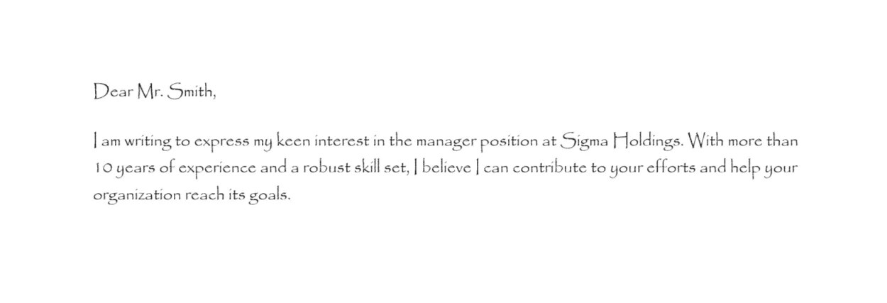
Serifs are small strokes attached to the ends of larger strokes of characters associated with classic and sophisticated fonts. Notable examples include Times New Roman, Garamond, and Georgia. These fonts are typically found in print, whether it’s books, newspapers, magazines, etc.
As a result, serif cover letter fonts are usually recommended when applying for traditional professions like law, banking, academia, etc.
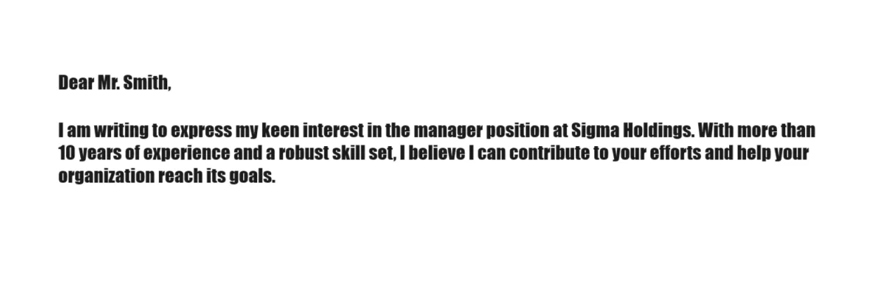
On the other hand, sans-serif fonts don’t have these decorative small strokes, making them clean and modern variants. Some of the examples of these fonts include Arial, Calibri, and Helvetica. The big perks of these fonts are their readability and versatility.
All of this makes sans-serif fonts great picks for contemporary industries and modern jobs, such as digital marketing, graphic design, software engineering, and so on.
Furthermore, sans-serif fonts are typically better viewed on screens, which is something to consider when sending a digital copy of your cover letter.
Need a clean, professional cover letter?
Build one in minutes with our simple cover letter builder.Cover Letter Font Size & Spacing
Cover letter font size and spacing are just as important as the font itself. Optimal values enhance the visual appeal of your document and ensure its readability, while inadequate size and spacing have the opposite effect.
The ideal font size is between 10 and 12 pt. For instance, both Google Docs and Microsoft Word have 11 pt as their default font size. That makes 11 pt the best starting point for your cover letter.
If your cover letter has a lot of text and crosses the one-page length limit, you can reduce the font size to 10. That way, you can keep your cover letter concise without cutting any content. However, you shouldn’t reduce the font size below 10 pt. Instead, you should trim and modify your writing.
Conversely, if you have a short cover letter and want to enhance its readability further, you can increase the font size to 12 pt. This also helps individuals with visual impairments, but you shouldn’t go overboard and increase the font size beyond 12 pt, as that will make it seem unprofessional.
Line spacing should be 1.0 (single spacing) or 1.15 within paragraphs. This is the optimal spacing for professional documents that ensures the best legibility. Just like with font sizes, you can use smaller or bigger line spacing depending on how much writing your letter has.
Additionally, you should use double spacing between sections and paragraphs to make them more distinct.
If you want to ensure optimal size and spacing effortlessly, you can use our cover letter builder. It features ready-made templates where everything is set up. You can just add your text and download a finished product.
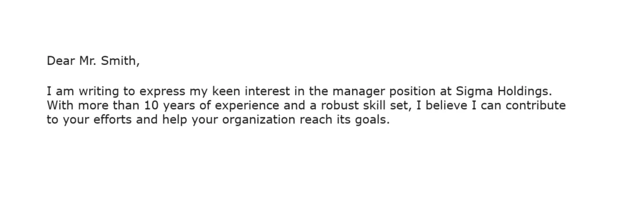
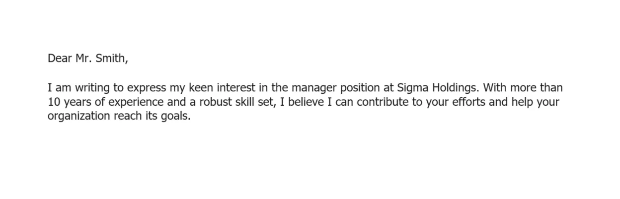
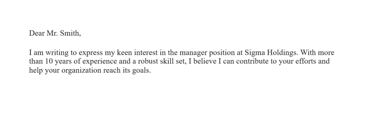
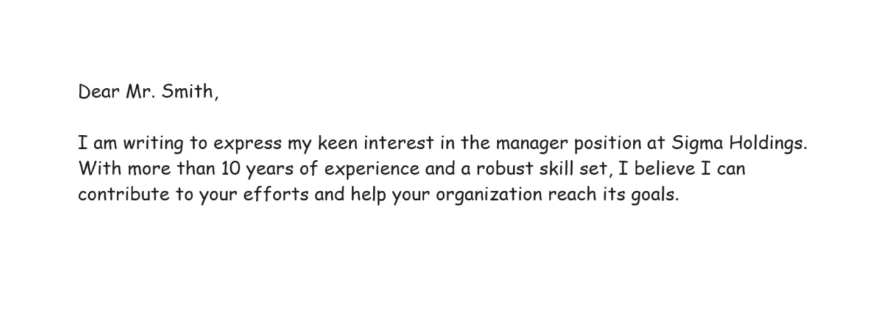
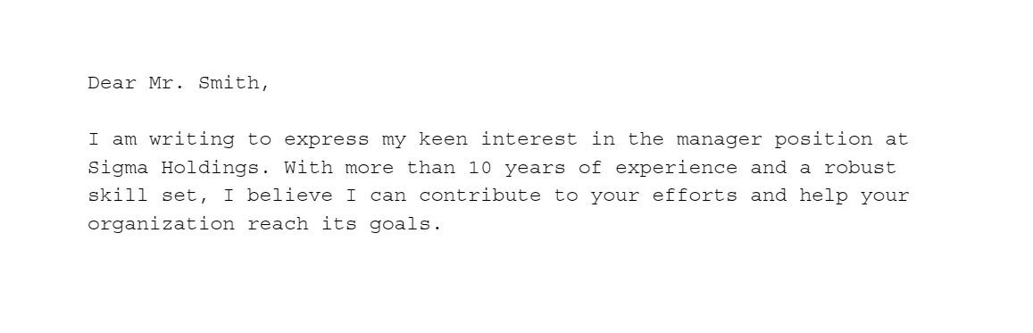
Let’s see what good font size and spacing should look like on an example of a cover letter designed using our builder:

Cover letter templates
Create a cover letter by filling in a free template and sharing it for freeCover letter font styling and formatting refer to specific techniques you can use to enhance the visual appeal and legibility of your cover letter. Here are some of the key ones:
Cover Letter Font Styling & Formatting
Bolding. Bolding specific parts of your cover letter is great for drawing attention to them. You can use it to emphasize your key skills or most notable achievements. This is also a great technique for structuring your cover letter, so you can bold section headings in addition to making their font size 2–4 pt larger.
Italicizing. Italicizing is a more subtle form of emphasizing text compared to bolding. It’s often used for specific parts of a cover letter, such as job titles, publications, foreign words, and other noteworthy parts of the document.
Capitalization. Capital letters are commonly used for names, headings, and acronyms. When used sparingly and appropriately, they significantly increase the appeal of your document and demonstrate your attention to detail.
Color. The established way of writing cover letters is in black font on a white background. You can choose a dark shade of gray for your font color as well, but you should avoid anything else, as it can be distracting. Exceptionally, a touch of color (e.g., a dark shade of blue) can be used for your name in the header.
However, you shouldn’t go overboard with styling and formatting. Here’s what you should avoid:
Dont's
Overusing bold text. By bolding too much of your writing, you’ll reduce clarity and significantly reduce the impact of bolding.
Underlining. Underlining is no longer a common styling technique, as it can be mixed up with online links, so you should avoid it.
Being inconsistent. You should stick to one cover letter font size, uniform margins, and consistent line spacing, or you’ll get a disorderly look.
4 Final Tips For Choosing the Right Cover Letter Font & Size
Now that you know all the ground rules regarding cover letter fonts and format, here are some final tips to help you make the perfect choice.
#1. Avoid Using More than One Font
Having more than one font in your cover letter creates a confusing and unprofessional experience. Multiple fonts in a single letter can be distracting, increasing the time needed to read it. That’s why it’s best to choose one versatile font that you can use for both writing and section headings.
That way, you’ll create a consistent visual language that looks clean and professional. As a bonus tip, you should also use the same font for your resume. That’s how you'll end up with a uniform application package demonstrating attention to detail.
#2. Play With the Design
You should experiment with different design elements until you create the perfect combination. Most apps you can use to create a cover letter (including our builder) allow you to effortlessly modify everything from your cover letter font to size and color, your document’s line spacing and margins, and more.
By playing with these values, you’ll get a clean and visually appealing layout. You should aim for a balanced look where all the design elements exist in harmony, creating a positive impression on hiring managers and potential employers.
#3. Keep it Simple
Simplicity is key when choosing the right cover letter font and format. That’s why it’s typically best to go with a simple typeface that isn’t overly stylized, stick to one font, keep its size uniform, avoid excessive colors, and so on.
Less is more in business correspondence, and a simple cover letter leaves room for the reader to focus on your skills and qualifications. Plus, it can be a strong indicator of good writing skills.
#4. Keep The Job You’re Applying For in Mind
Your cover letter should be tailored to the job you’re applying for. This goes not only for the contents of your letter but for its font, too. That’s why it’s important to consider different aspects when choosing a cover letter font, such as the type of industry that you’re in and the company’s culture.
Final Thoughts
Choosing a cover letter font is much more than an aesthetic decision. It directly impacts the influence your document has on the reader and the first impression it leaves. A good font demonstrates your professionalism and attention to detail, helping you best convey information about your competence.
Now that you know what font is best for your cover letter, all that’s left is to write and submit it. Remember to keep the industry, company, and role in mind when choosing the font; you’ll be one step closer to the interview. Before you get there, you might want to brush up on the most common interview questions and answers. Best of luck!
Related Articles
How to Start a Cover Letter Like an Expert [w/ Examples & Tips]
Resume Design: A Comprehensive Guide with Tips and Tools

