
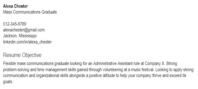
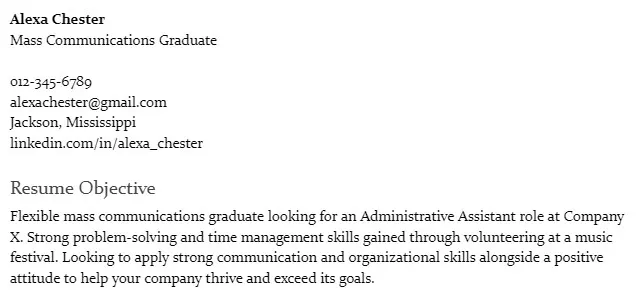
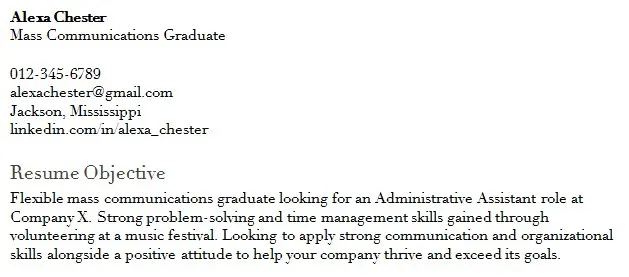
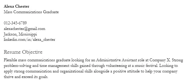
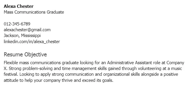
You created an outline for your resume, and you definitely have a good design template in mind. All that is left is to choose the best font for a resume, and you can start writing. While this might seem like a minor choice, it’s actually crucial for making a good first impression.
Understanding the basics will make you find the best font to use for a resume much easier. Serif fonts (with their decorative “tails”) are traditional and sophisticated. Hence, they are a good choice when applying to a law firm, an accounting company, or similar.
On the flip side, sans-serif fonts (without “tails”) are modern, clean, and minimal. Some companies (like Google in 2015) stopped using serif fonts and continued with sans-serif. These are usually a smart choice when applying to tech companies, startups, etc.
So, what is the best font for a resume, and how to know which ones you should avoid when applying for a specific job? We can solve this dilemma for you! Read this guide and check out the list of top-tier fonts based on their design, readability, and ability to be eye-catching.
Key Takeaways
The best sans-serif fonts to use on your resume are Arial, Helvetica, and Gill Sans, while the best serif fonts are Georgia and Garamond.
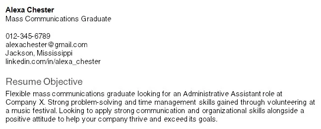
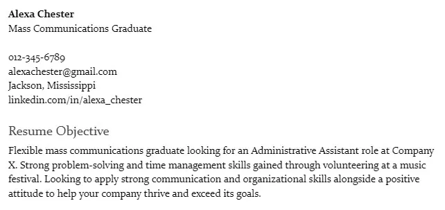
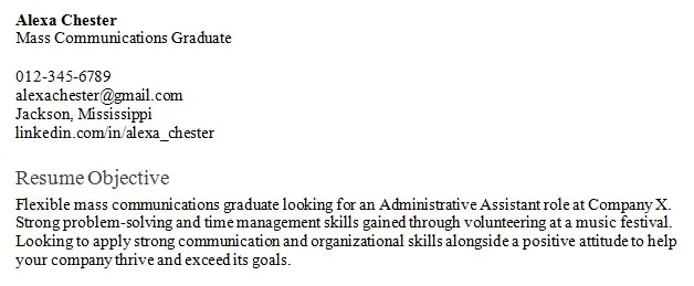
The right font for your resume will look serious and professional, grab the recruiter’s attention in the first few seconds, and pass the ATS scan.
The best font size for a resume is 10–12 for the body, 12–16 for headings, and sometimes 20–24 for your name.
When formatting, you should use bold and italic to emphasize important parts, avoid underlining, skip highlighting, and use black text on a white background.
15 Best Fonts to Use for a Resume

Without further ado, let’s check out which fonts are the best choice for your resume!
We’ve prepared a list of the 15 best fonts for a resume in 2026. Study them, and then pick the one that suits your needs.
#1. Arial
Arial is a sans-serif font, and it’s most commonly known as the default Google Docs or Microsoft Word font. It’s clean, easy to read, and modern, which is why many website and mobile designers choose it as the best option for their projects. That also makes this font perfect for resumes related to the tech, IT, and marketing fields.
Many recruiters say that Arial is the most common font they find on resumes, so it might not be the most daring option on the list. But, if you’re looking for a safe pick that will work in most cases, this is the one you want to use!
#2. Calibri
Speaking of smart and play-it-safe fonts, Calibri is another great sans-serif choice which belongs to ClearType fonts. Alongside its serif counterpart, Times New Roman, Calibri is considered the norm when it comes to resumes. After all, it was designed as a substitute for Times New Roman in Microsoft Office, which speaks volumes about its versatility.
It’s a professional and readable font, recommended by experts worldwide. The fact that it’s so common also means it will likely display correctly on most devices.
#3. Verdana
Verdana was released in 1996 with the goal of being legible on smaller, pixelated screens. Slightly wider letters with clear spacing are what make this font readable. Verdana is the best font to use if you have a lengthy resume but not enough space to use some of the other fonts on the list.
This font also remains one of the top choices in a professional setting. As with previous fonts, there are bolder choices, but this is a safe, classic pick that has withstood the test of time.
#4. Tahoma
Tahoma was designed by the same person who created Verdana. The two fonts are very similar, with Tahoma having a narrower structure and much tighter spacing between letters. That made it popular with programming environments—it was even used by operating systems such as Windows 2000 or XP.
All that makes this font perfect for technical resumes. It can also make your resume look a bit punchier than the previous fonts on the list.
#5. Georgia
Speaking of fonts similar to Verdana, Georgia is its serif counterpart. Just like Verdana, it was designed to be readable on smaller screens or when printed. It’s strikingly similar to classic Times New Roman, except it’s wider.
The New York Times uses Georgia as their standard font, which means it's been tested in a professional environment. It can easily be the best font for a resume if you’re looking for a serif variant that exudes a friendly tone.
#6. Times New Roman
The three words that describe Times New Roman best would be traditional, classic, and recognizable. After all, it’s one of the most popular fonts of all time! Times New Roman is a smart choice if you want a serif font that will work on any occasion.
This font is slightly narrower than Georgia and is also the most common font used on resumes.
#7. Helvetica
Ask any established designer what their go-to font is—no matter the circumstance—and the majority will say it’s Helvetica. When creating it, Swiss designers wanted to develop a neutral font that would have a wide variety of uses. For this reason, it’s also the perfect font for a resume.
Helvetica is a clean and minimalist sans-serif font, ranked by many as one of the most beautiful typefaces. The downside to it is that you need to pay for using it unless you have a Mac. Other than that, you can use Arial as a substitute.
#8. Cambria
Like Calibri, Cambria belongs to the ClearType font group. Such fonts were made to be readable on LCD and low-resolution screens, as well as on smaller prints. Cambria, for example, was specifically designed to be a body text.
This font is a great choice for online resumes, as it’s the default font for typing software. On top of that, its strong look makes it appear just as good when printed, which makes it an amazing all-rounder among resume fonts.
#9. Trebuchet MS
Trebuchet MS is a sans-serif font that succeeded Tahoma as the default Windows XP font. It’s a widely used font that has a lot of web use and comes free with the Windows OS and Microsoft Office package.
The main characteristic of Trebuchet MS is that it’s thicker than other fonts on the list. That makes it take a bit more space. As a result, it’s ideal if you’re creating your first resume and you have fewer details to put in.
#10. Garamond
If you’re looking for a classic and traditional font for your resume but you find Times New Roman too common, check out Garamond. This font was inspired by a typeface from the 16th century. It’s been perfected for hundreds of years to become one of the best fonts for a resume in 2026.
Even though Garamond is not as commonly used as Times New Roman, it’s still one of the most popular fonts. On top of that, it’ss a bit more condensed than Times New Roman, which makes it a better choice if you need to fit more text on your resume.
#11. Didot
Since we’re in the realm of older fonts, Didot originated between 1784-1811. It has been used by the likes of Vogue and Ralph Lauren since it radiates class and elegance.
So, if you need a serif font that will make your resume tasteful, Didot is the way to go. Keep in mind, however, that the complex, contrasty look of this font doesn’t make it the best choice when you’re aiming for simplicity. Yet, it’s still a great option if you’re applying for a job in the fashion or photography field.
#12. Book Antiqua
Book Antiqua is a free font that comes with the Windows OS and many Microsoft applications. It’s a clone of a famous serif font called Palatino. Palatino has larger letters to help with visibility and is incredibly popular and widely copied. Apart from a few minor details, Book Antiqua is identical to it.
As the name suggests, Book Antiqua can give off an aged feeling. One of its variants is a corporate font used by the UK Parliament. However, it comes free with many programs and it’s an excellent choice in the serif font group. It works wonderfully in the field of law, political sciences, and similar.
#13. Arial Narrow
Arial Narrow is one of many variants of the Arial font. It’s similar to regular Arial in many ways, except that it’s more condensed. So, if you planned on using Arial as your resume font but you have more text than you can fit on your resume, Arial Narrow is a way to go. It’s a bit less readable, but it will do the trick.
Arial Narrow is also used a lot because it is one of the fonts that come with the Windows OS.
#14. Constantia
Constantia is another font in the ClearType group. Because of that, it’s similar to Calibri and Cambria when it comes to main characteristics. Just like the rest of the serif fonts in the group, it’s meant to be read both in small print and on lower-resolution screens.
On top of that, Constantia comes with rounder letters, which make it even more legible. Thanks to that, this font is a fine choice if you want something safe but less common than the rest of the list.
#15. Gill Sans
Last but not the least on our “best font for resume” list is Gill Sans—a mix of modern and classic fonts. It’s a sans-serif font designed in the 1920s. Still, regardless of its age, lots of modern companies, like Tommy Hilfiger or United Colors of Benetton, use it as their main font.
If you’re looking for the best of both old and new worlds or something clean and refined, there’s no better choice than Gill Sans. Another great thing about this font is that you can find it on MacOS, Google Fonts, Microsoft Word, and many other applications.
What is the Ideal Font Size for a Legible Resume?
Once you find the best font for a resume, the next step is to choose the ideal size.
If your font size is too small, the text will be unreadable. Make it too big, and the content won’t look natural. People are used to the font sizes found in books and newspapers, which is what you want to replicate in your resume to grab the recruiter’s attention.
The body of your resume should have a font size between 10 and 12pt—feel free to adjust it based on how much text you have. Size 12 makes serif fonts perfectly readable, but if you have more text and need to lower the size to 10, you might benefit from a more readable sans-serif font.
The font size used for headers and section titles should range from 12 to 16pt. These font size differences create hierarchy and make it easy for the recruiter to notice distinct sections of your resume.
Finally, if you want to make your name more prominent, you can use a 20–24pt font size. Many resume templates—whether ATS-friendly, modern, minimalist, or professional—already come with optimal font sizes and formatting, so using one can save you time and help your resume look polished.
How Should a Resume Font be Formatted?

Once you choose the best font to use for a resume and pick its size, it’s time to continue with formatting.
Bold, Italics, and Underline
When it comes to bolding, italicizing, or underlining text in your resume, less is more. All three format options are used to emphasize parts of your resume. But the more you use these options, the less impact they carry. And if you overuse them, the resume can end up looking messy.
Bolding is the most common option, as it makes parts of text truly stand out, but save it for the most important parts of your resume. Italics are the second most popular and a bit more subtle option, while underlining is becoming less common.
Font Color and Highlighting
When it comes to font color, black font on a white background is the safest and usually the best option. Certain combinations of darker colors for fonts could also work if they fit the resume’s theme and are used occasionally. You can also use a white font on a colored section of your resume, but you need to know what you’re doing or have a designer to help you out.
Save the highlighting for college books and studying sessions. Even the best font for a resume won’t look good when highlighted. It makes the resume look unprofessional and the text less readable.
Font Casing
Font casing refers to letter capitalization. Most people think of “ALL CAPS'' as yelling, which is not something you want on your resume. If you want to emphasize certain parts of the text, use bold or italics.
Uppercase letter capitalization is fine if you want to use it in headings. That way, you can discern different parts of your resume, which can, in turn, make your resume more readable.
Why Is Choosing the Right Resume Font Important?
You only get one chance at making a good first impression. The font makes up the majority of your resume, so it’s important that it looks great and matches the job you’re applying for. Some companies even use scanning software to speed up the hiring process, which can cause problems if you use a font that is hard to read.
Also, most recruiters don’t read every resume—they just skim it. You could have as little as 6–7 seconds to grab their attention. That’s not nearly enough time for hiring managers to see your skills, qualifications, and achievements. In such cases, your font will be one of the first things their attention will be drawn to.
You can use any font from the list, as their success has been repeatedly proven, but keep in mind that there are still differences between them. Depending on factors such as your field of work or the position you’re applying for, some fonts will perform better than others.
Fonts to Avoid Using for Your Resume
Our list of the 15 best fonts for a resume is not set in stone. These fonts are the best and safest choices, but they aren’t the only ones. There are, however, a select number of fonts you should avoid using in your resume under any circumstances. These include:
Fonts to Avoid
Comic Sans. It’s asans-serif font designed for comic books and content for children. As such, it has no place in a professional environment.
Courier. This font wasdesigned for a typewriter and then adapted for computers. It’s wide and clunky, takes a lot of space, and doesn’t look good in professional documents.
Script. Script fonts are unprofessional, unreadable, and the absolute worst choice for resumes.
Papyrus. This one is amost as infamous as Comic Sans. It features distinctive characteristics that are completely unfit for a resume.
Impact. Big and boxy, Impact was made for impactful headlines—not professional resumes.
Take the first step toward your next job.
Create your resume with our builder today.Closing Thoughts
And that’s all!
At this point, you should have enough information to know what the best font for a resume is. Regardless of the job that you’re applying for, one of the 15 fonts on this list will do the trick. On top of that, you now also have enough information about font size and formatting to craft a perfect resume.
Start by figuring out what type of font is best suited for your future position. Decide whether you’ll go for a serif or a sans-serif font, and then go through the list until you find the one that fits your resume best!

